Is a house named “yellow” really yellow? Survey on the perception and naming of the yellow color on building facades depending on its hue, lightness and saturation
DOI:
https://doi.org/10.23738/CCSJ.140112Keywords:
yellow, color in architecture, color attributes, color naming, color appearance, color perceptionAbstract
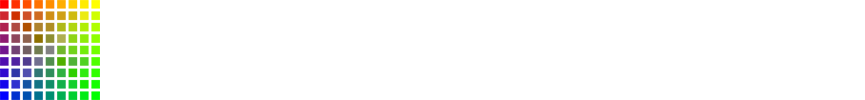
The article's primary goal is to present the author's online color survey results. The study was aimed at checking which colors chosen from NCS Color System's four yellowish hue groups: G80Y, G90Y, Y, and Y10R are perceived as "yellow." The 28 nuances differed in hue, lightness, and chroma, were presented separately on color swatches and building facades. At first, the respondents assessed the yellowness of selected colors and then indicated the most appropriate ones for the color term "yellow." The analysis of the 444 results confirmed the high importance of saturation and lightness (whiteness/blackness level) in color appearance and naming. The research proved that a given color is likely described as "yellow" only when its parameters of lightness and saturation are similar to the prototype of the yellow color category, characterized by high saturation and high intrinsic lightness. The clarity of the hue was also a significant factor.
References
Divers, E. (2021) ‘Beyond hue: the affective response to value and chroma’, in: Griber, Y.A. and Schindler, V. M., (eds) The International Scientific Conference of the Color Society of Russia: Selected papers, Smolensk: Smolensk State University Press, pp.154-159.
Janssens, J., and Küller, R. (2009) ‘Preferences on colors on buildings’, in: T. Porter, T. and B. Mikellides, B. (eds) Color for Architecture Today. London: Taylor and Francis, pp.124–127.
Lancaster, M. (1996) Colorscape. London: Academy Editions.
Pastoureau, M. (2019) Yellow: The History of a Color. Princeton: Princeton University Press.
Schloss, K., Witzel, Ch. and Lai. L.Y. (2020) ‘Blue hues don’t bring the blues: questioning conventional notions of color-emotion associations’, Journal of the Optical Society of America A, vol.37/no.5. pp. 813-824. doi: 10.1364/JOSAA.383588
Tarajko-Kowalska, J. (2021) ‘Yellow color in European architecture and built environment: traditions and contemporary application’, In: Griber, Y.A. and Schindler, V. M., (eds) The International Scientific Conference of the Color Society of Russia: Selected papers, Smolensk: Smolensk State University Press, pp. 319-324.
Witzel, Ch. (2018) ‘The role of saturation in colour naming and colour appearance’ in: L. MacDonald, L., Biggam, C.and Paramei, G. ed., Progress in Colour Studies. Cognition, language and beyond, John Benjamins Publishing Company. pp. 41–58.
Witzel, Ch., Maule, J., and Franklin, A.. (2019) ‘Red, yellow, green, and blue are not particularly colorful’, Journal of Vision 19(14):27. pp. 1-26. doi: 10.1167/19.14.27
Downloads
Published
Issue
Section
License
Copyright (c) 2022 Cultura e Scienza del Colore - Color Culture and Science

This work is licensed under a Creative Commons Attribution 4.0 International License.
The "Cultura e Scienza del Colore - Color Culture and Science" journal is registered at the Court of Milan at n.233 of 24.06.2014.
The journal is an open access journal, free for readers and authors and has joined ROAD, the Directory of Open Access scholarly Resources, since 2014. Articles published in the “Cultura e Scienza del Colore - Color Culture and Science" journal are open access articles, distributed under the terms and conditions of the Creative Commons Attribution License (CC BY). The copyright is retained by the author(s).
